Thank you to everyone who joined my talk on making WooCommerce accessible! As promised, here’s an in-depth guide to expand on what we covered. In this post, I’ll dive into actionable steps and specific examples for building a more accessible WooCommerce store, from choosing an accessible theme to optimizing forms on the checkout page.
Outline
- Why Accessibility in E-Commerce Matters
- Choosing an Accessibility-Ready Theme
- Structuring Your Content with Proper Headings
- Adding Descriptive Link Text
- Optimizing Keyboard Navigation
- Adding ARIA Labels for Icons and Controls
- Providing Alt Text for Images
- Simplifying Forms on Checkout Pages
- Accessible Payment Gateways
- Avoiding JavaScript Traps
- Regular Testing and Maintenance
- Final Thoughts: Accessibility is Key to Growth
- Resources
Why Accessibility in E-Commerce Matters
Inaccessible websites create barriers for users with disabilities, from struggling with navigation to completing purchases. Accessible design isn’t just a legal requirement in many regions—it’s an opportunity to reach more customers and create a smoother experience for all.
Choosing an Accessibility-Ready Theme
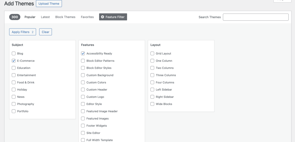
An accessibility-ready theme provides a strong foundation for your site. Starting with a theme built for accessibility means fewer adjustments later on. WordPress offers an “Accessibility Ready” filter for themes.

Filtering for Accessibility-Ready themes in WordPress to ensure a more inclusive and user-friendly website design.
How to Find an Accessible Theme:
- Go to your WordPress dashboard.
- Navigate to Themes > Add New > Feature Filter.
- Select “Accessibility Ready” and “E-commerce,” then apply.
- Choose an accessibility-ready theme. Recommended Theme: Storefront is a WooCommerce-friendly theme optimized for accessibility.
Check Accessibility With testing tools:
WAVE Accessibility Tool: Run WAVE on your site to check for structural issues and color contrast errors.
Equalize Digital Accessibility Checker Plugin: Test the demo pages with the Accessibility Checker plugin to confirm that the theme is indeed Accessibility-Ready.
NVDA or VoiceOver: Try navigating through the site using NVDA or VoiceOver to understand how users who rely on these assistive technologies will experience your site.
Why This Matters:
Non-accessible themes often have navigation, color contrast, or structure issues that make it hard for users with disabilities to interact with your site.
Choosing an accessibility-ready theme also saves you time spent on making sure your website is fully accessible.
Structuring Your Content with Proper Headings
Headings are critical for screen readers, guiding users through the page in a structured and logical way. A clear heading hierarchy also improves SEO and user experience for all visitors.
Best Practices:
- Use one H1 tag per page (usually the page title).
- Use H2 tags for main sections, followed by H3 for subsections.
- Avoid skipping heading levels (e.g., don’t go from H1 to H3 without an H2).
Example for Product Pages HEADINGS:
- H1: Product Title
- H2: Product Description
- H3: Product Specifications
Tool for Testing:
- WAVE: This tool can identify skipped heading levels and other structural issues.
- Accessibility Checker Plugin: This plugin will notify you of skipped headings or possible headings.
Why This Matters:
A clear heading structure is essential for screen readers, as it helps users understand the layout of the page. Skipping heading levels can confuse screen readers, making it difficult to navigate.
Adding Descriptive Link Text
Vague link text like “Click here” or “Learn more” does not provide context. Descriptive link text tells users (and search engines) where the link will take them.
Best Practice:
- Instead of “Click here,” write “Learn more about our accessible designs.”
- For buttons, use labels that describe their action. Instead of “More info,” use “More about product specs.”
Example Links:
- “View product details for Coral V-neck T-shirt”
- “Read our guide on accessible shopping features”
Why This Matters:
Descriptive links improve navigation for screen readers and make your site more understandable and accessible for all users.
Optimizing Keyboard Navigation
Keyboard navigation is crucial for users who can’t use a mouse. All interactive elements, including buttons, forms, and modals, should be accessible via the Tab key.
Implementation Tips:
- Set tabindex=“0” on focusable elements like modals and custom buttons to ensure they’re accessible by the keyboard.
- Test your site by navigating through it entirely using the Tab and Shift+Tab keys.
Example:
- Ensure the “Add to Cart” and checkout buttons are accessible by the keyboard on every page.
Why This Matters:
Keyboard traps—where users can’t navigate out of an element—are a significant barrier for users who rely on keyboard navigation. Optimizing for keyboard accessibility ensures everyone can interact with your site.
Adding ARIA Labels for Icons and Controls
ARIA (Accessible Rich Internet Applications) labels add context to elements that are hard for screen readers to interpret on their own. For instance, icons and custom buttons without visible text need ARIA labels to clarify their purpose.
Best Practices:
- Use aria-label=”Shopping Cart” for a cart icon.
- Label social media icons with their function, like aria-label=”Follow us on Instagram”.
Example Code:
<a href="/cart" aria-label="Shopping Cart"><i class="icon-cart"></i></a>Why This Matters:
Without ARIA labels, screen readers might not understand the purpose of icons and buttons, causing frustration for users who rely on assistive technology.
Providing Alt Text for Images
Alt text describes images for users who rely on screen readers or have images disabled. Every image on your site should include alt text that conveys its purpose.
Best Practices:
- Describe the purpose of the image, not just the object in it. For example, instead of “T-shirt,” write “Coral-colored V-neck T-shirt made from soft fabric, ideal for casual wear.”
- Use an empty alt=”” attribute for decorative images that don’t add context, so screen readers skip them.
Why This Matters:
Alt text is essential for users with visual impairments and contributes to SEO by giving search engines information about the image.
Simplifying Forms on Checkout Pages
Checkout is a critical step in the customer journey. Forms should be easy to navigate, clearly labeled, and avoid unnecessary fields.
Best Practices:
• Label each field so screen readers announce its purpose (e.g., “Full Name” for the name field).
• Group related fields under headings like “Billing Information” and “Shipping Information.”
• Remove unnecessary fields to simplify the checkout process.
Why This Matters:
Clarity in form fields reduces cart abandonment, especially for users with cognitive disabilities or those relying on assistive technologies.
Accessible Payment Gateways
An accessible payment gateway is essential for creating an inclusive and smooth checkout experience, especially for users who rely on assistive technologies. Without accessible payment options, customers might abandon their cart, impacting both the customer experience and sales. Here’s how to make sure your payment gateway is accessible:
Best Practices
1. Choose Accessible Gateways
- Select payment providers that prioritize accessibility, such as PayPal or Stripe, which are known for offering accessible experiences for users with disabilities.
- Test the gateway on multiple devices and with screen readers like NVDA or VoiceOver to ensure compatibility and ease of use.
2. Keyboard Navigation Support
- Ensure that every element of the payment process, from entering card details to confirming the payment, can be accessed and completed using only the keyboard.
- Avoid forcing users to rely on a mouse or touchscreen, as keyboard-only navigation is essential for users with motor impairments.
3. Clear and Descriptive Labels
- All fields should have clear labels and instructions. For example, label fields as “Card Number” or “Expiration Date” rather than using placeholder text that disappears when typing.
- Add aria-labels or aria-described by attributes to enhance screen reader compatibility.
4. Error Handling and Alerts
- If there is an error in the payment process (e.g., invalid card number), ensure that clear, accessible error messages are provided.
- Use ARIA live regions to notify screen reader users of errors or confirmation messages immediately.
5. Readable CAPTCHA or Alternatives
- If you use CAPTCHAs for security, consider alternatives like invisible CAPTCHAs or accessible audio CAPTCHAs to ensure accessibility for users with visual impairments.
6. Multi-Currency and Localization Options
- If your store caters to an international audience, select a gateway that supports multiple currencies and languages. This helps create a more inclusive experience for a global user base.
Why This Matters
Accessible payment gateways help reduce cart abandonment and ensure a smooth and inclusive experience for users with disabilities. By selecting and optimizing an accessible gateway, you improve customer satisfaction and ensure that your checkout process aligns with accessibility standards.
Avoiding JavaScript Traps
JavaScript elements like modals and pop-ups need to be accessible, meaning they can be opened, closed, and navigated without a mouse.
Best Practices:
• Ensure modals can be closed using the Esc key.
• Make sure users can tab through modal content and return to the main page when done.
Testing Tips:
• Open a modal with the keyboard and try to exit using Esc.
• Ensure modals have a clear, visible close button and that tabbing through the page doesn’t get “trapped.”
Why This Matters:
JavaScript traps are particularly frustrating for users who rely on screen readers or keyboard navigation, as they prevent users from fully interacting with the site.
Ensuring Consistent Layout and Navigation
A consistent layout makes navigation predictable and intuitive, especially for screen reader users. Every page should have a similar structure, and key elements like the “Add to Cart” button should be in the same place.
Best Practices:
• Keep the navigation bar in a consistent location on all pages.
• Use the same button style and placement for important actions, like adding to the cart.
Why This Matters:
Consistency helps users feel more comfortable and can reduce frustration, particularly for users with cognitive disabilities or those new to online shopping.
Regular Testing and Maintenance
Accessibility is a continuous effort. Regular testing with tools like WAVE, Axe and Screenreaders helps you catch new issues that may arise with updates or design changes.
Recommended Tools:
- WAVE: Analyzes accessibility issues on your page and provides guidance for fixes.
- Axe: Browser-based tool for identifying accessibility issues.
- Equalize Digital Accessibility Checker: A plugin that checks accessibility in the WordPress dashboard.
- NVDA (NonVisual Desktop Access): A free, open-source screen reader for Windows, helpful for testing screen reader accessibility.
- VoiceOver: A built-in screen reader for macOS and iOS devices, allowing you to experience how your website is navigated by visually impaired users.
Why This Matters:
Regular checks help maintain accessibility over time, ensuring that your site remains usable and compliant with standards as it evolves.
Final Thoughts: Accessibility is Key to Growth
Making your WooCommerce store accessible doesn’t just improve the experience for users with disabilities—it benefits everyone. From better navigation and usability to improved SEO, accessible design fosters a more inclusive, user-friendly, and effective online store.
By following these steps, you’re not only supporting inclusivity but also enhancing your store’s potential reach and customer loyalty. Accessibility is an ongoing commitment, so continue testing, learning, and adapting your store to ensure everyone can enjoy a seamless journey from click to cart.
One Last Thing…
One last thing I think I forgot to mention in my talk: “you never know who your inaccessible store affects”. I have a personal example that I hope will illustrate this. As I mentioned during my talk, I provide support for a WooCommerce plugin, and a few weeks ago, I was checking a merchant’s website for an issue they reported. Their site had a welcome banner with flashing lights. Now, as someone who is epileptic and sensitive to flashing lights, this was a real problem for me.
Accessibility isn’t just a checklist—it’s about ensuring everyone can engage with your site safely and comfortably. Simple design choices, like avoiding flashing animations, can make a world of difference. Remember, accessibility isn’t just about meeting standards; it’s about respecting and caring for your customers.

Comments
Loading comments...